Wednesday, May 18, 2011

Forced Perspective

technique description.
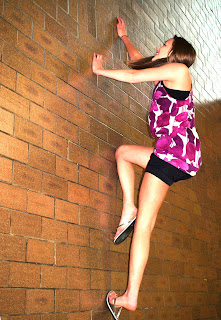
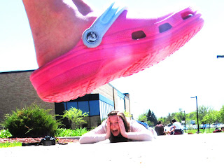
For these photos, we created forced perspective. In the first one, I took a picture of Emma crawling on the floor in the commons and rotated the picture to make it look like she was climbing up a wall. For the second, Sydney laid on the ground far away from the camera and I set up one person close to the camera pretending to stomp their foot down. It looks like there's a giant shoe about to step on Sydney. For both photos, I made adjustments to the curves and levels and then duplicated the background layer and used a blending mode on it.

reflection.
I think these photos worked pretty well to create the illusion of a different perspective. We found it a bit difficult to come up with ideas for pictures, though, and kept running into the problem of depth of field; the objects farther back were blurred out. I fixed this by increasing the aperture setting to create great depth of field.

Monday, May 9, 2011

Selective Color


technique description.

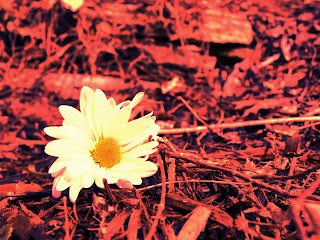
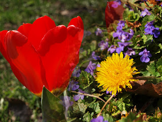
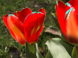
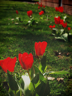
For this assignment, we worked on altering the color schemes of photos. To do this, you add a new fill layer of the color you want to change something to. Use a layer mask to block out any area where you dont want to change the color, and pick a blending mode that blends it in realistically. For the first picture, the darkest flower used to be purple. It distracted from the complimentary color scheme so I made it red. In the second picture, I changed the background- which had a lot of brown woodchips distracting from the subject. I made it all green to look more like the flower was just in a field of grass.

reflection.

I think I did a good job using the selection tool to change the color of the first photo. The edits look pretty realistic. However, the second one could be a bit better. I'm not sure I like the background to be all one color.

Thursday, May 5, 2011

Color: Meaning and Mood


technique description.
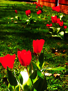
For this assignment, I used color to create a mood in my photo. I used complimentary colors (red and green). I enhanced the colors and added contrast by using the curves and hue/saturation adjustments. Then I adjusted the colors slightly using the selective color. I also added a vignette and lens flare.

reflection.
I like the way this photo turned out, especially the lighting and the texture in it. The flower seems to be reaching up towards the sky. The colors help to set the mood; red portrays a sense of boldness, determined, energetic, lively, and triumphant. The green is aspiring, fresh, natural, safe, and free. The flower seems full of energy and wonder, reaching up towards the sun and the whole setting feels very natural and free.

Friday, April 29, 2011

Gradient Maps


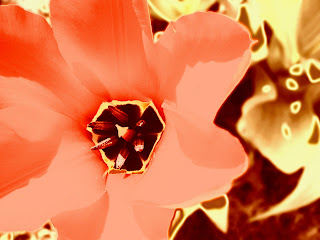
blue/red/yellow gradient map;
color dodge blending mode


blue/yellow gradient map;

opacity


browns gradient map;
linear light blending mode


gradient tool


gradient tool


technique description.
Today we learned about using Gradient Maps (found under the adjustments tab). Using the Gradient Maps, you can do a lot of fun things with color in your photos. In addition, you can work with the blending mode of the gradient map. To make the effect more subtle, you can take down the opacity.

reflection.

I really like this effect because there are a lot of different things you can do with it to change your photos. I thought the colors in my first photo were really pretty.

Thursday, April 28, 2011

Solarization


negative solarization, layer mask


positive solarization


negative solarization, black&white


positive solarization, hue blending mode


technique description.

For this assignment, we learned how to use Solarization. To create this effect, you work with the curves adjustment. For negative solarization, you drag the curves to make an ark, or rainbow shape. For positive, it should look like a 'U'. I made some of the edits more interesting by putting them in black&white, changing the blending mode, or using a layer mask to make only part of the photo solarized and leaving part of it original.

reflection.
Overall, I like the way these turned out. I think the solarization is a fun way to edit photos, especially when mixed with blending modes or other edits. I especially like the way my last one turned out because the colors in the tree are really fun. I also thought it was cool how the solarization just touched the tips of the petals in the first photo.

Wednesday, April 20, 2011

Creative Colors


Pictorialism

Vintage

High Color Contrast

technique description.
For this assignment, we worked with different ways to edit our photos using creative colors. To create a Pictorialism effect, I made the photo darker and added a vignette. I also added some grain and blurred the edges of the photo. For the vintage-looking photo, I adjusted the color curves to make the colors look different- more like aged film. I also applied a yellowish filter and lightened the colors a bit. Finally, to create high color contrast, I used curves to add a lot of contrast to the photo and upped the saturation. I duplicated the layer and used the Hard Light blending mode.

reflection.
I think these photos turned out pretty well, it was fun to edit them in a different way! One thing that was a bit difficult was that this particular photo only really has two main colors in it so there wasn't a lot I could do to drastically change it.

Monday, April 11, 2011

Typography


technique description.

For this photo, I first edited it using some adjustments (color balance, curves, levels). I also sharpened the picture just a little bit using the high pass filter. Then, I added text in Illustrator. To do this, I used the pencil tool to draw a curve circling the knothole and down following a crack in the bark. Then I used Type-on-a-Path to type along the line. I made the text white to stand out on the dark tree and picked a font that was simple and natural, but kind of bold so it was easier to read.


reflection.

I think this photo turned out well. I really like the way that the text circles the knothole and blends well into the photo. One thing that was difficult was making the text stand out because it wasn't showing up very well. To fix this I had to find a bolder font. It was also difficult to find a good quote but I finally found this one I liked by John Muir.

Tuesday, April 5, 2011

Sharpness

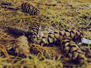
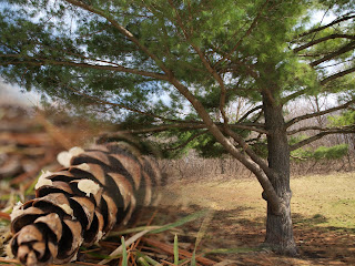
technique description. My theme for these photos (and the rest of the quarter) was nature close-ups. To edit this photo, I adjusted the colors and curves a bit and then added some sharpness. First, I duplicated the background layer. Then I went under Filter > Other > High Pass. I chose to do a radius of about 9; the higher the number, the sharper the image becomes. This makes the image greyish and emphasizes the lights and darks. Finally, I had to change the blend mode to Overlay. I also added a layer mask and used a brush with opacity 50% to remove some of the background and make it less sharp again. reflection. I think this photo turned out well. I like the texture and colors in the pine cone. The sharpness really enhanced the texture and improved the picture while the color adjustments made it more interesting. One thing that was difficult when taking these pictures was trying to find some nature in the first place- there's not a lot out this time of year!

Thursday, March 17, 2011

Rhythm


technique description.
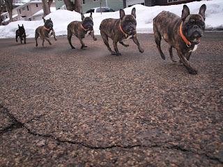
For this project, we focused on rhythm: the repetition of visual elements or subjects. I took several pictures of the same subject, either in motion or simply in different places. I used one of these photos as the 'background' photo. Then, for the other four, I selected the subject from each photo using the selection tools we've been working with. I applied a layer mask so that the only thing visible was the subject and I pasted that layer onto the background one. I also used some adjustments to fix the color and lighting to make the images look more realistic and vibrant.

reflection.
I think I did a good job editing these photos to make them look like there were multiples of the one subject. One thing I encountered was my dog turned out very dark in the photos and when I tried to adjust the levels, the shadow got light too. I fixed this by duplicating the layer, but getting rid of the shadow before adjusting that layer.

Friday, March 11, 2011

Selection


technique description.
To edit these photos, I used the various selection tools in photoshop (lasso, quick selection, magic wand...) to select an area. Then, I made the rest of the photo black&white (using the adjustments) to put emphasis on the subject.

reflection.
I think my photos turned out pretty well. The selections are good and I used the tools correctly to make the background black&white. One thing that was kind of frustrating was when the quick selection tool would select more than I wanted it to, and I switched to using the magnetic lasso.

Thursday, March 3, 2011

Portraits


natural. backlighting. reflected. lens flare.

natural. 3/4 lighting. surface blur.

artificial. front. diffused. surface blur. photo filter.


technique description.
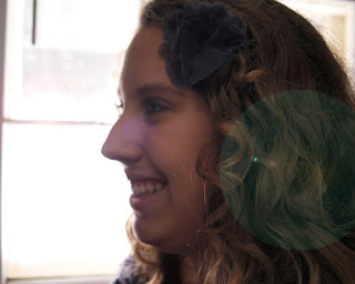
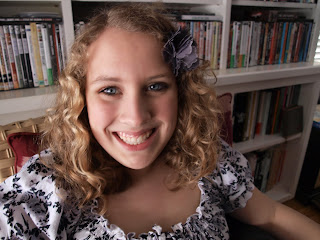
For this assignment we focused on Portrait photography and working with different types of lighting. We did both studio and natural lighting, and then worked with different angles (back, side, 3/4, front) and different techniques (direct, diffused, reflected). When editing on Photoshop, we learned how to work with the Spot Healing tool and the Surface Blur with a layer mask to even out skin in close-ups. We also learned about using an Overlay layer and the brush tool to enhance features. We also worked with lighting effects and photo filters.

reflection.
I think that I did a good job editing these photos. They still look realistic, but I enhanced the features of my subjects and evened out their skin. I also used lens flares and photo filters to add interest to the photos. One thing that I could have done better, however, was my photos in artificial lighting. They didn't turn out very well because it was kind of dark and a lot of them ended up being kind of blurred from the subject moving.

Wednesday, February 16, 2011

White Balance


this photo was taken using the 'cloudy' white balance setting and made black&white


this photo was taken using the 'florescent' white balance setting and edited with a vignette


technique description.
For this project, we worked on changing the white balance settings on the camera.
White balance is the process of removing unrealistic color casts. It lets white objects appear white by using an orange or blue filter.
Sometimes, a photo can develop a color cast from the color temperature, and can appear tinted. I used the different white balance settings (tungsten, daylight, florescent, shade, cloudy, flash) to create more realistic looking photos. To edit the photos, we focused on the color balance adjustment and worked with black&white. We also learned to use the clone stamp tool and how to make a vignette using the marquee and layer mask tools.


reflection.
My photos for this project came out well. I think I did a good job taking and editing the photos to make sure there wasn't a strange color cast. I also feel I did well adding a vignette and choosing which photos to make in black&white. Something I could improve on, however, is choosing the right white balance settings. Some of my photos turned out better when I did 'auto' white balance and actually gained a color cast with the filter I chose.

Friday, February 4, 2011

A Day In The Life


technique description.

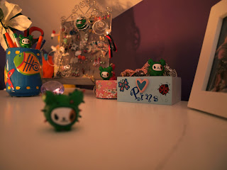
This project focused on the topic 'A Day In The Life': taking photos from something/someone's perspective. I followed around my pencil for a day and got a good idea of all that it sees! We also learned about using ISO.
ISO measures how sensitive the image censor in your camera is to the amount of light present. Higher ISOs are more sensitive and can take pictures in lower-light conditions, but they tend to have more noise.
For this image, I used an ISO of 100. Then, I edited the photo using photoshop. I used the image adjustments and worked with Levels, Vibrance, and Color Balance.

reflection.

Overall, I think I did well with this assignment. I think the subject matter is interesting and gives a new point of view- what a pencil sees- on a somewhat normal scene. I used all different ISOs to change the way the light appeared in each photo. I also think that I did a pretty good job editing it to make the colors more vibrant, but still realistic. The hardest part of this assignment was trying to find fifteen different things to photograph. Something I could've done better is to create more interesting scenes; I had enough to work with but some others were not as good.

Monday, January 31, 2011

Artist Statement

I create art for fun! Right now it's just a hobby for me but I hope to have a career involving photography someday. I'm often inspired by ads I find in fashion magazines; I love to use photoshop and I sometimes try to recreate ads or do my own take on them. So far, I have taken a lot of photos on my own and edited some on photoshop. I've worked a little bit with film in Photo 1. I've also done some work taking senior pictures for family members.

Andy Goldsworthy
Andy Goldsworthy is an extremely interesting photographer who focuses his photos on scenes in nature. For most of his works, he sets up these scenes using only his bare hands and objects he finds outside. I think what he does is really genius, especially in a world where people have moved so far away from nature into industry and technology; he does a great job of portraying nature so beautifully.