Friday, April 29, 2011

Gradient Maps


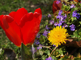
blue/red/yellow gradient map;
color dodge blending mode


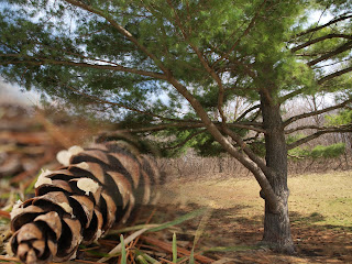
blue/yellow gradient map;

opacity


browns gradient map;
linear light blending mode


gradient tool


gradient tool


technique description.
Today we learned about using Gradient Maps (found under the adjustments tab). Using the Gradient Maps, you can do a lot of fun things with color in your photos. In addition, you can work with the blending mode of the gradient map. To make the effect more subtle, you can take down the opacity.

reflection.

I really like this effect because there are a lot of different things you can do with it to change your photos. I thought the colors in my first photo were really pretty.

Thursday, April 28, 2011

Solarization


negative solarization, layer mask


positive solarization


negative solarization, black&white


positive solarization, hue blending mode


technique description.

For this assignment, we learned how to use Solarization. To create this effect, you work with the curves adjustment. For negative solarization, you drag the curves to make an ark, or rainbow shape. For positive, it should look like a 'U'. I made some of the edits more interesting by putting them in black&white, changing the blending mode, or using a layer mask to make only part of the photo solarized and leaving part of it original.

reflection.
Overall, I like the way these turned out. I think the solarization is a fun way to edit photos, especially when mixed with blending modes or other edits. I especially like the way my last one turned out because the colors in the tree are really fun. I also thought it was cool how the solarization just touched the tips of the petals in the first photo.

Wednesday, April 20, 2011

Creative Colors


Pictorialism

Vintage

High Color Contrast

technique description.
For this assignment, we worked with different ways to edit our photos using creative colors. To create a Pictorialism effect, I made the photo darker and added a vignette. I also added some grain and blurred the edges of the photo. For the vintage-looking photo, I adjusted the color curves to make the colors look different- more like aged film. I also applied a yellowish filter and lightened the colors a bit. Finally, to create high color contrast, I used curves to add a lot of contrast to the photo and upped the saturation. I duplicated the layer and used the Hard Light blending mode.

reflection.
I think these photos turned out pretty well, it was fun to edit them in a different way! One thing that was a bit difficult was that this particular photo only really has two main colors in it so there wasn't a lot I could do to drastically change it.

Monday, April 11, 2011

Typography


technique description.

For this photo, I first edited it using some adjustments (color balance, curves, levels). I also sharpened the picture just a little bit using the high pass filter. Then, I added text in Illustrator. To do this, I used the pencil tool to draw a curve circling the knothole and down following a crack in the bark. Then I used Type-on-a-Path to type along the line. I made the text white to stand out on the dark tree and picked a font that was simple and natural, but kind of bold so it was easier to read.


reflection.

I think this photo turned out well. I really like the way that the text circles the knothole and blends well into the photo. One thing that was difficult was making the text stand out because it wasn't showing up very well. To fix this I had to find a bolder font. It was also difficult to find a good quote but I finally found this one I liked by John Muir.

Tuesday, April 5, 2011

Sharpness

technique description. My theme for these photos (and the rest of the quarter) was nature close-ups. To edit this photo, I adjusted the colors and curves a bit and then added some sharpness. First, I duplicated the background layer. Then I went under Filter > Other > High Pass. I chose to do a radius of about 9; the higher the number, the sharper the image becomes. This makes the image greyish and emphasizes the lights and darks. Finally, I had to change the blend mode to Overlay. I also added a layer mask and used a brush with opacity 50% to remove some of the background and make it less sharp again. reflection. I think this photo turned out well. I like the texture and colors in the pine cone. The sharpness really enhanced the texture and improved the picture while the color adjustments made it more interesting. One thing that was difficult when taking these pictures was trying to find some nature in the first place- there's not a lot out this time of year!